from dotenv import load_dotenv
load_dotenv()

import numpy as np
import pandas as pd
import matplotlib.pyplot as plt13 Analytics on embeddings
Clustering, visualizing, and using text as features
Every month, thousands of tickets arrive, most of which are never read one by one. A handful of problems drive most of the volume, and nothing in the data marks which ticket belongs to which problem. Until now, we have used embeddings only to search: turn a query into a vector, and find the nearest chunks. But an embedding is a set of coordinates for a piece of text, and once text has coordinates, every tool of ordinary data analysis applies. We can cluster the vectors to discover themes nobody labeled, project them to two dimensions to see the structure of a corpus, and feed them to a plain classifier as features. In this chapter, we mine the report corpus three ways, the first two of which do not require any labels, and we show that a simple linear model on embeddings is a real classifier. Parts V through VIII are the specialize stage of the Chapter 1 lifecycle. In Part V, we turn the system’s embeddings toward analytics.
NoteIn the running system
Until now, embeddings powered search. Here, our desk turns them on its own backlog, clustering thousands of tickets to surface the themes nobody labeled. The same vectors that retrieve a filing also map what the queue is really about.
NoteSetup for this chapter
Run in the gaba-core environment with an OPENROUTER_API_KEY (used only to name the discovered topics). We reuse the report corpus and gaba.embed (the embedding model downloads on a first run). Embedding the chunks takes under a minute on CPU.
First, embed the corpus. These vectors are the raw material for everything that follows.
from gaba.rag import chunk_markdown, REPORTS
from gaba.embed import embed_texts
from gaba import DATA_DIR

documents, companies = [], []
for ticker, filename in REPORTS.items():
    for chunk in chunk_markdown((DATA_DIR / "filings" / filename).read_text()):
        documents.append(chunk)
        companies.append(ticker)

X = embed_texts(documents)
print("embedded:", X.shape)
embedded: (560, 1024)13.1 Tools in this chapter
| Tool | Why we use it here | Alternatives | Trade-off |
|---|---|---|---|
| scikit-learn | the standard library for k-means, PCA, and the classifier, all on plain vectors | cuML for GPU scale | familiar and CPU-friendly against not built for huge corpora |
| t-SNE / UMAP | project high-dimensional vectors to two dimensions for a picture | PCA (faster, linear) | reveals local structure against distorting global distances |
| BERTopic | packages embed, cluster, and label into one topic pipeline | hand-rolling the three steps | convenience against less control |
Part V closes, in Chapter 14, with the analytics stack. The tooling-landscape appendix lists the current options.
13.2 Clustering: themes without labels
Clustering groups the vectors by proximity, so that chunks that mean similar things land in the same group, without anyone labeling them. We run k-means (which sorts points into k groups by proximity) for six clusters and ask a simple question: do the clusters line up with the companies, or do they capture something else? The adjusted Rand index measures the agreement between two groupings, with 1 being identical and 0 random.
from sklearn.cluster import KMeans
from sklearn.metrics import adjusted_rand_score

kmeans = KMeans(n_clusters=6, random_state=0, n_init=10).fit(X)
ari = adjusted_rand_score(companies, kmeans.labels_)
print(f"clusters vs companies, adjusted Rand index: {ari:.2f}")
clusters vs companies, adjusted Rand index: 0.25The index lands in the middle, well above random but well below a perfect match, and this middling value is the interesting result: the clusters partly follow company lines, because each company’s report has its own vocabulary, but they also cut across companies to group shared themes, risk-factor language, revenue discussion, governance, wherever they appear. Clustering did more than rediscover the labels we already had: it surfaced structure we never labeled, which is what we want from it on a corpus that carries no labels at all.
One more check before we trust any of this: k-means starts from random centers, so a different random seed can produce a different clustering of the same data. The same adjusted Rand index that compared the clusters to companies can compare one run to another.
from itertools import combinations

runs = {seed: KMeans(n_clusters=6, random_state=seed, n_init=10).fit(X).labels_
        for seed in [0, 1, 2]}
for a, b in combinations(runs, 2):
    print(f"seed {a} vs seed {b}: ARI = {adjusted_rand_score(runs[a], runs[b]):.2f}")
seed 0 vs seed 1: ARI = 0.65
seed 0 vs seed 2: ARI = 0.50
seed 1 vs seed 2: ARI = 0.67Pairs near 1.0 would mean the structure is stable and the seed is a formality. The further the pairs fall below that, the more the cluster boundaries are an artifact of where the centers started and the less they are a fact about the corpus. Whatever the printed values show, the discipline is the same: treat a clustering as a lens that depends partly on its random start, report the stability check next to the result, and never present a single run’s clusters as the definitive structure of the data.
13.3 Seeing the structure: dimensionality reduction
The vectors have 1024 dimensions, which we cannot look at. Dimensionality reduction projects them down to two so we can plot them. Projection is exactly the right word, with the trap the word implies: a shadow can merge things that are far apart. Two points distant in the full space can land on top of each other in a careless 2-D view, the way a sphere and a flat disk cast the same circular shadow.
import numpy as np
import matplotlib.pyplot as plt

rng = np.random.default_rng(3)
a = rng.normal([0, 0, 0], 0.35, (40, 3))
b = rng.normal([0.3, 0.3, 4], 0.35, (40, 3))   # far away, but only in depth

fig = plt.figure(figsize=(9.5, 3.2))
ax0 = fig.add_subplot(1, 3, 1, projection="3d")
ax0.scatter(*a.T, color="#0969da", s=12); ax0.scatter(*b.T, color="#cf222e", s=12)
ax0.set_title("the data (3-D)", fontsize=10)
ax0.set_xticks([]); ax0.set_yticks([]); ax0.set_zticks([])

ax1 = fig.add_subplot(1, 3, 2)
ax1.scatter(a[:, 0], a[:, 1], color="#0969da", s=12, alpha=0.7)
ax1.scatter(b[:, 0], b[:, 1], color="#cf222e", s=12, alpha=0.7)
ax1.set_title("careless shadow: collapsed", fontsize=10)
ax1.set_xticks([]); ax1.set_yticks([])

ax2 = fig.add_subplot(1, 3, 3)
ax2.scatter(a[:, 0], a[:, 2], color="#0969da", s=12, alpha=0.7)
ax2.scatter(b[:, 0], b[:, 2], color="#cf222e", s=12, alpha=0.7)
ax2.set_title("better shadow: separation kept", fontsize=10)
ax2.set_xticks([]); ax2.set_yticks([])
plt.tight_layout(); plt.show()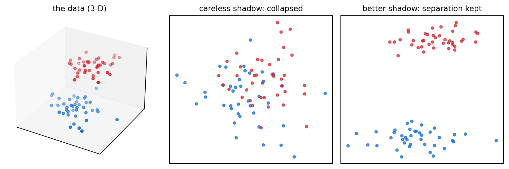
A linear method like PCA (principal component analysis) is fast but, on embeddings, captures only a sliver of the variance in two dimensions. A nonlinear method like t-SNE (t-distributed stochastic neighbor embedding) is slower but far better at revealing local structure, so it is the right choice for a picture. Its main knob, perplexity, is roughly how many neighbors each point balances. We use 30, a common default.
from sklearn.manifold import TSNE

coords = TSNE(n_components=2, random_state=0, perplexity=30).fit_transform(X)
import textwrap
import plotly.express as px
tsne_df = pd.DataFrame({
"x": coords[:, 0], "y": coords[:, 1], "company": companies,
"preview": ["<br>".join(textwrap.wrap(d[:140], 45)) + "..." for d in documents],
})
fig = px.scatter(tsne_df, x="x", y="y", color="company",
custom_data=["preview"], height=480)
fig.update_traces(marker=dict(size=5, opacity=0.75),
hovertemplate="%{customdata[0]}<extra>%{fullData.name}</extra>")
fig.update_layout(title="The report corpus in two dimensions (t-SNE), colored by company",
legend_title_text="", margin=dict(l=10, r=10, t=40, b=10))
fig.update_xaxes(visible=False)
fig.update_yaxes(visible=False)
fig.show()Each company forms recognizable neighborhoods, with overlap where their reports discuss the same subjects, and the picture makes the corpus visible. One caution governs how to read it: t-SNE warps global distances to surface local structure, so you can trust that nearby points are similar, yet the size of the gaps between clusters carries no meaning, and a clean-looking separation is suggestive without being conclusive. Confirm what the picture suggests with a metric, the clustering index above or the classifier accuracy below, before you put it in front of a stakeholder.
The interactive version in the online edition is drawn with Plotly so that hovering a point shows its chunk, which is exactly how you spot-check an embedding map: read what the neighbors say. The analysis is identical; only the rendering changes.
In current practice, UMAP (uniform manifold approximation and projection) has become the default for embedding maps. It is faster on large corpora and preserves a bit more of the global layout. Every caution we just gave about reading the picture applies to it unchanged.
The same projection also lets us see what the k-means clusters from the previous section actually found.
fig, ax = plt.subplots(figsize=(7, 5))
for c in range(6):
    mask = kmeans.labels_ == c
    ax.scatter(coords[mask, 0], coords[mask, 1], label=f"cluster {c}", s=18, alpha=0.7)
ax.set_title("The same projection, colored by discovered cluster")
ax.set_xticks([]); ax.set_yticks([])
ax.spines[["top", "right"]].set_visible(False)
ax.legend()
plt.tight_layout()
plt.show()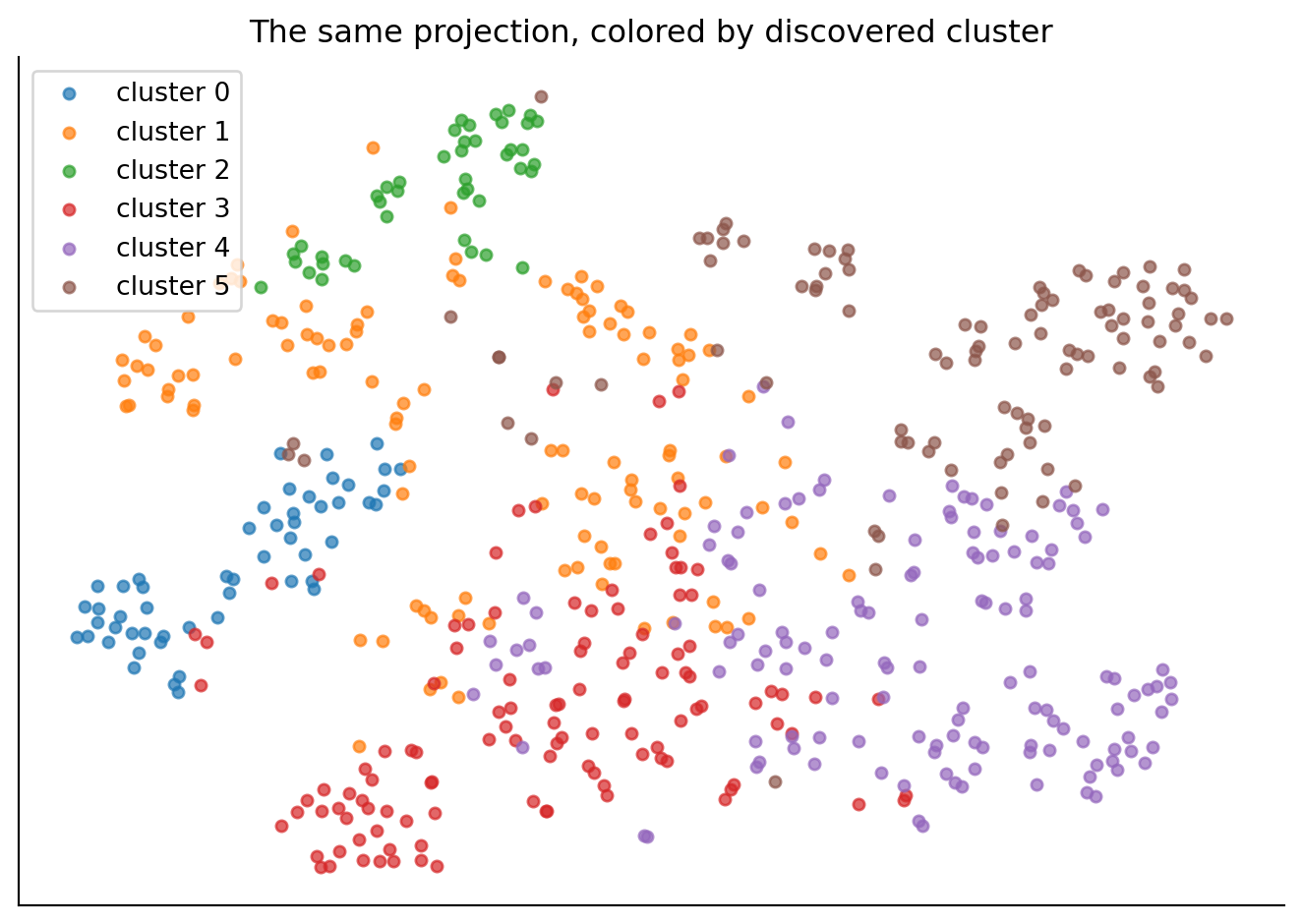
The choice of six clusters was ours, so we check how much rides on it. K-means scores a clustering by its inertia, the sum of squared distances from each point to its cluster center, and since inertia falls every time k goes up, so that the lowest value always sits at the largest k tried, the elbow heuristic picks the k where the fall flattens out. The demo below clusters the 2-D projection so the boundaries are visible on screen, while the chapter’s real analysis clusters the full 1024-dimensional vectors.
The demo shows the mechanics on the 2-D projection; the choice itself should be made on the real 1024-dimensional vectors. We sweep k from 2 to 12 and score each clustering two ways: inertia, for the elbow heuristic, and the silhouette score, which measures how much closer each point is to its own cluster than to the nearest other one (1 is ideal, 0 means the clusters touch).
from sklearn.metrics import silhouette_score

ks = list(range(2, 13))
inertias, silhouettes = [], []
for k in ks:
    km = KMeans(n_clusters=k, random_state=0, n_init=10).fit(X)
    inertias.append(km.inertia_)
    silhouettes.append(silhouette_score(X, km.labels_))

fig, axes = plt.subplots(1, 2, figsize=(8, 3.4))
axes[0].plot(ks, inertias, marker="o", color="#0969da")
axes[0].set_xlabel("k"); axes[0].set_ylabel("inertia")
axes[1].plot(ks, silhouettes, marker="o", color="#8250df")
axes[1].set_xlabel("k"); axes[1].set_ylabel("silhouette score")
for ax in axes:
    ax.spines[["top", "right"]].set_visible(False)
plt.tight_layout()
plt.show()

print(f"silhouette prefers k = {ks[int(np.argmax(silhouettes))]} "
      f"(score {max(silhouettes):.3f})")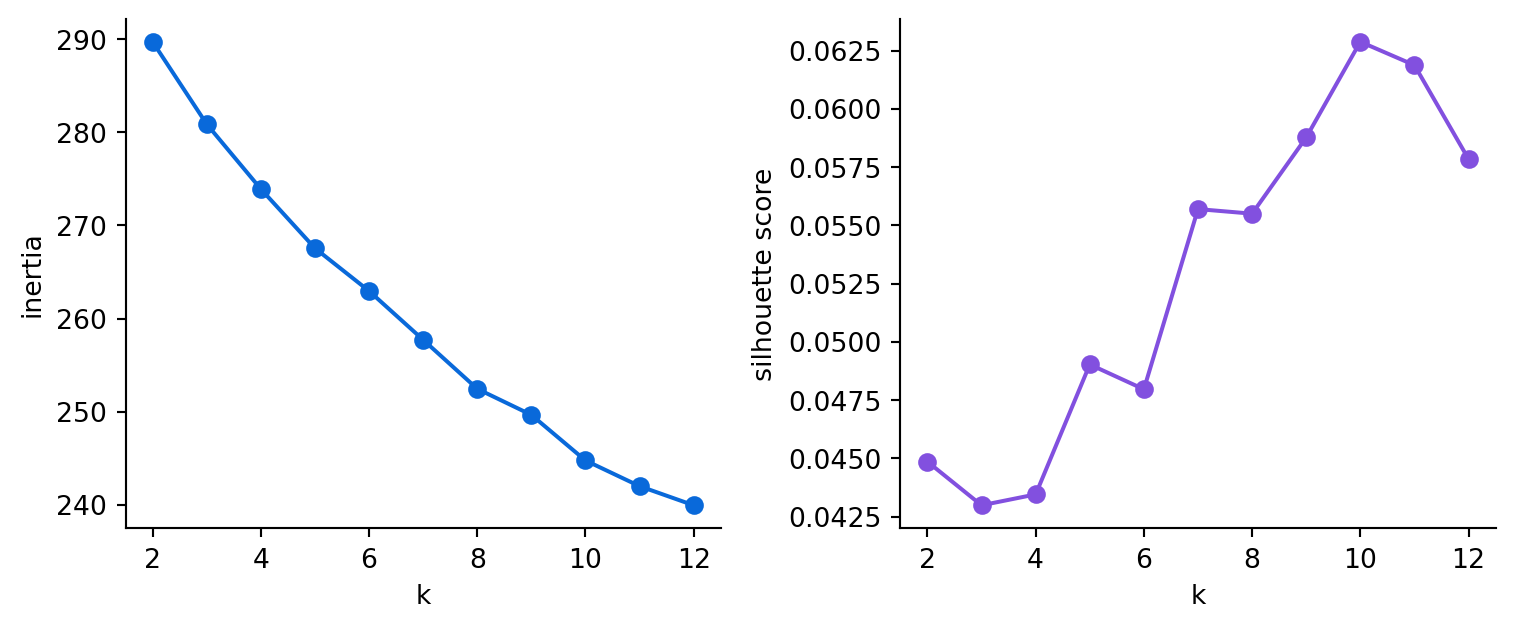
silhouette prefers k = 10 (score 0.063)Read the two panels for what they show. The inertia curve bends gradually, with no single obvious elbow, and the silhouette scores are low across the board, which is normal for high-dimensional embeddings of prose: the themes in these reports overlap, so no k carves them into well-separated balls, and the k the silhouette prefers (printed above) is a weak preference among close alternatives. Our six is therefore a defensible reading choice, picked because six clusters were few enough to name and inspect; the data itself demands no particular value, so the fair summary is that this corpus supports a range of reasonable k values, and the metrics’ job here is to rule out the unreasonable ones.
13.4 Naming the themes: topic discovery
A cluster is a set of chunks, which is not yet a topic. To turn clusters into topics, we hand a few chunks from each cluster to a model and ask it to name the theme in a short phrase. This is the bridge from unsupervised structure to something a human can read.
from gaba.llm import call_llm

topic_names = []
print("discovered topics:")
for c in range(6):
    members = [documents[i] for i in range(len(documents)) if kmeans.labels_[i] == c][:3]
    sample = "\n---\n".join(m[:200] for m in members)
    name = call_llm(
        f"These passages are from one cluster of annual-report text:\n{sample}\n\n"
        "Name their common theme in 3-5 words.",
        system="You name topics concisely.",
    ).text.strip()
    topic_names.append(name)
    print(f"  cluster {c} (n={list(kmeans.labels_).count(c)}): {name}")
discovered topics:
cluster 0 (n=53): Strategic priorities and sustainability
cluster 1 (n=115): Forward-looking statements, risk
cluster 2 (n=43): SEC Filing Requirements
cluster 3 (n=116): Insurance business growth.
cluster 4 (n=134): Customer-centric operational improvements
cluster 5 (n=99): Debt and RestrictionsA name is easier to judge when placed next to the cluster’s composition: how big it is, and which companies dominate it. A cluster dominated by one company is that company’s vocabulary; a cluster spread across several is a genuine shared theme.
ct = pd.crosstab(kmeans.labels_, np.array(companies))
summary = []
for c in range(6):
    shares = (ct.loc[c] / ct.loc[c].sum()).sort_values(ascending=False)
    summary.append({
        "cluster": c,
        "size": int(ct.loc[c].sum()),
        "topic": topic_names[c],
        "top companies": ", ".join(f"{t} {s:.0%}" for t, s in shares.head(3).items()),
    })
pd.DataFrame(summary)| cluster | size | topic | top companies | |
|---|---|---|---|---|
| 0 | 0 | 53 | Strategic priorities and sustainability | AMBC 100%, AMZN 0%, ATSG 0% |
| 1 | 1 | 115 | Forward-looking statements, risk | BKH 41%, HRL 20%, BAC 12% |
| 2 | 2 | 43 | SEC Filing Requirements | BKH 23%, ATSG 14%, PK 14% |
| 3 | 3 | 116 | Insurance business growth. | BAC 34%, PK 32%, HRL 15% |
| 4 | 4 | 134 | Customer-centric operational improvements | AMZN 43%, TSLA 27%, HRL 15% |
| 5 | 5 | 99 | Debt and Restrictions | ATSG 52%, TSLA 20%, PK 20% |
The table is the mid-range adjusted Rand index from earlier, itemized: some rows are dominated by a single company (the part of the structure that follows company lines), while others draw a real share from two or three (the cross-company theme part). It is also the reality check on the topic names: a tidy name over a one-company cluster is just that company’s style restated.
Now the clusters have names a person can act on. Run the same pipeline on ten thousand support tickets and you have an unsupervised map of what customers are writing in about, no taxonomy required, the kind of result that gets a project funded. This is one more step along Chapter 1’s ladder: where rules match exact words, a trained classifier matches patterns of wording, and a generative model responds to what the customer meant, clustering by embedding groups tickets by what their writers meant, before anyone has defined the categories. The cluster-then-name pipeline is exactly what the popular BERTopic library packages, embed, reduce, cluster, and label, so once you understand the steps here you can reach for the packaged version.
13.5 Text as features for ordinary machine learning
The third use is the most direct of the three. An embedding is a fixed-length numeric vector, which is exactly the input a standard classifier takes, so we can hand the embeddings to a plain logistic regression (a standard linear classifier), predict the company a chunk came from, and thereby turn a text problem into a standard tabular one. We score it with five-fold cross-validation: train on four-fifths of the chunks, test on the held-out fifth, repeat five times, and average.
from sklearn.linear_model import LogisticRegression
from sklearn.model_selection import cross_val_score

acc = cross_val_score(
    LogisticRegression(max_iter=1000), X, companies, cv=5
).mean()
majority = pd.Series(companies).value_counts(normalize=True).max()

print(f"logistic regression on embeddings, 5-fold accuracy: {acc:.0%}")
print(f"majority-class baseline:                            {majority:.0%}")
logistic regression on embeddings, 5-fold accuracy: 80%
majority-class baseline: 12%
TipWith an AI coding tool
Wiring a cross-validated logistic regression against a majority-class baseline is ordinary boilerplate, and an assistant will get the folds, the scoring, and the baseline right on the first try. What it cannot decide for you is which baseline makes the comparison honest: the majority-class rate is the number that has to be beaten before the accuracy above means anything, and random guessing, a common substitute, sets the bar too low. Generate the calls quickly, then check that the baseline the assistant picked is the one this chapter actually needs.
The two numbers side by side make the margin plain.
fig, ax = plt.subplots(figsize=(5, 4))
bars = ax.bar(["Embeddings +\nlogistic regression", "Majority-class\nbaseline"],
              [acc, majority], color=["#0969da", "#cf222e"], width=0.55)
ax.bar_label(bars, labels=[f"{acc:.0%}", f"{majority:.0%}"], padding=3)
ax.set_ylabel("5-fold accuracy")
ax.set_ylim(0, 1)
ax.spines[["top", "right"]].set_visible(False)
plt.tight_layout()
plt.show()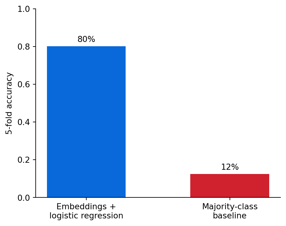
A linear model, among the simplest classifiers, reads the embeddings and predicts the company far above the majority-class baseline. To keep this in proportion: telling these companies apart is an easy task, their reports use distinctive vocabulary, so the result shows the embeddings encode that content; it offers no evidence that a linear model is a strong general classifier. The durable point is narrower and still valuable: we wrote no rules and engineered no features; the embedding is the feature engineering. This is the workhorse use of embeddings in business analytics, because any text column you have, customer comments, product descriptions, support tickets, becomes a set of numeric features that feed the same models you already use, with the same tools you already know. (A keyword baseline like TF-IDF, short for term frequency-inverse document frequency, often does well on an easy task like this one too, which is why the chapter’s exercise asks you to compare them.)
13.6 Evaluation: did the structure we found mean anything?
Two of the three analyses come with their own metric, which is what keeps unsupervised methods from fooling us.
Clustering is measured by the adjusted Rand index against a grouping we trust (here, company). A value near zero would mean the clusters were noise; the mid-range value we got means they captured real, partly-known structure. Classification is measured by cross-validated accuracy against a baseline; beating the majority-class rate by a wide margin is what tells us the embeddings carry signal beyond what a constant guess of the most common class would supply. Topic discovery has no automatic metric, which is the catch with unsupervised methods: the only real test of a topic name is whether a human reads it and agrees it describes the cluster. This absence makes topic discovery a place to proceed with care, because a tidy-looking label is no evidence that the cluster it names is coherent, so read a sample from each cluster yourself before you trust its name.
TipCost: analytics on embeddings is mostly free
Clustering, projection, and classification all run locally on vectors you already computed; their cost amounts to a few seconds of CPU, with no API bill involved. The only paid step here is naming the topics, one short model call per cluster. Embeddings, computed once, keep paying off: the same vectors that power search also power all of this analysis at no additional embedding cost. On owned hardware the same reuse reads as capacity and latency, because the embedding pass, the only heavy compute in the pipeline, never has to run twice.
WarningDon’t outsource this
An assistant can write the k-means, t-SNE, and classifier code in seconds. It cannot tell you whether a cluster is coherent or a topic name is deserved. Read a sample of each cluster’s chunks and judge the label yourself; an unsupervised result that no human has examined is a result you do not yet understand.
13.7 Exercises
13.7.1 Conceptual questions
Clustering the corpus gave an adjusted Rand index in the middle of the range against company labels. What does that indicate?
- the k-means run failed to converge, so a different algorithm is needed instead
- the embedding model failed to capture the meaning of the chunks
- six was precisely the right number of clusters to match the companies
- clusters partly follow companies and partly group themes that cross them
Why prefer t-SNE over PCA for visualizing embeddings in two dimensions?
- PCA keeps only a sliver of the variance in two dimensions; t-SNE reveals local structure better
- t-SNE runs faster than PCA on a corpus of this size and scales better
- PCA requires labeled data, while t-SNE works without any labels at all
- t-SNE preserves global distances exactly, which makes the plot’s gaps meaningful
Which part of the chapter’s t-SNE plot can you trust, and which can you not?
- both the neighborhoods and the gaps become reliable once perplexity is tuned
- neither is reliable; the plot is decoration with no analytic value
- nearby points are similar, but the size of the gaps carries no meaning
- the gaps between clusters are meaningful, but point neighborhoods are arbitrary
In the k-means demo, inertia falls every time k goes up. How should k be chosen?
- choose the k with the lowest inertia, since a lower value always means better fit
- look for the elbow where extra clusters stop adding much improvement
- set k equal to the number of labels you expect the data to contain
- run t-SNE first and count the visible clumps in the projection
“The embedding is the feature engineering” means:
- embeddings remove the need to fit any downstream model, the vector is the prediction
- text features must still be designed by hand before they are embedded
- the vector is ready-made numeric input for a standard classifier
- embeddings only work as features inside other neural networks
The classifier’s accuracy is reported next to the majority-class baseline because:
- beating a guess of the most common class shows the embeddings carry real signal
- the baseline marks the highest accuracy that any linear model could reach on this task
- cross-validation is only valid when a baseline is included in the folds
- the majority class changes across folds, so it has to be tracked separately
Which analysis in this chapter has no automatic metric, so a human must check it?
- classification, since accuracy says nothing about which errors matter
- clustering, since two groupings cannot be compared with a number
- dimensionality reduction, since a scatter plot cannot be checked
- topic naming, where a tidy label can sit on an incoherent cluster
The chapter calls telling these companies apart an easy task. Given that, the classifier’s high accuracy shows:
- that a plain linear model is a strong general-purpose text classifier
- that the embeddings encode the reports’ distinctive content
- that the result will transfer unchanged to harder text tasks
- that embedding features always beat TF-IDF by a wide margin
13.7.2 Build lab
Re-run the clustering with a different number of clusters (try 3 and 10) and compare the adjusted Rand index against company labels. Report which k best matches the companies and which k surfaces the most interpretable cross-company themes when you name them. Decide which k you would use and why.
13.7.3 Evaluate lab
Compare embeddings to a bag-of-words baseline as features: vectorize the same chunks with TfidfVectorizer, train the same logistic regression, and measure cross-validated accuracy. Report whether the embeddings beat TF-IDF on this task, and explain in one sentence what kind of task you would expect embeddings to win by more.
NoteWhere we go next
Embeddings covered the text half of this part. In Chapter 14, we turn to the other half, the highest-value business use of these models: answering questions over your structured data. We build a system that translates a plain-English question into SQL, runs it, and checks its own work.